
Ever wondered why some spaces feel more peaceful than others? Perhaps this is due to the Vastu-aligned wallpaper in your living room. Certain wallpaper designs are known to promote feelings such as harmony and positivity. This article aims to provide detailed information on designs, colours, and patterns to improve positive vibrations in your home. Certain colours and patterns to avoid for your wallpaper are also mentioned in this blog. Additionally, guidance based on directions is also provided. Use this information and make the required changes that are sure to bring positive effects to your life.
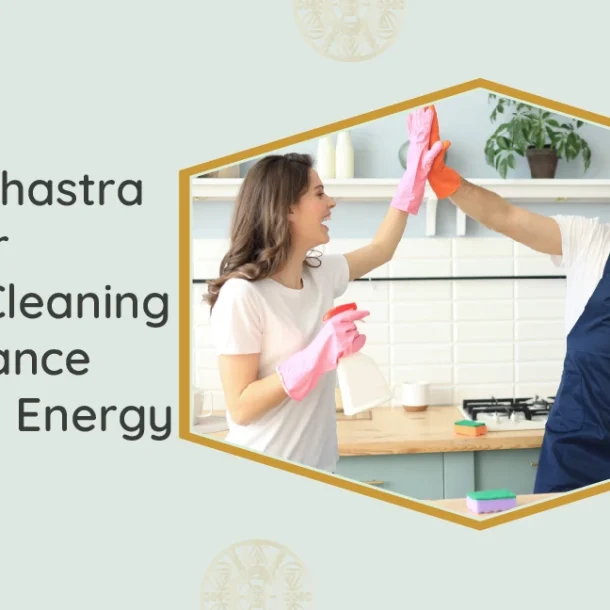
Looking to Improve Your Living Room’s Energy Flow?
Choose Vastu-inspired wallpaper to create a space filled with peace, harmony, and positive vibes.
A] Vastu-Aligned Wallpaper Ideas for Your Living Room
As your living room is an area used for both interactions and relaxation, you should avoid going for dominating designs.
Nature-inspired
Nature-inspired wallpaper in the form of lush green landscapes or even waterfalls will work to create a calming vibe. Even a serene floral wallpaper here will work well to make your energy feel balanced.
Soft Gradients
Gradient wallpapers in colours such as pink, blue, and purple can be used to improve the Vastu of your living room. Most of the gradient design wallpapers are subtle yet perfect for promoting feelings of relaxation.
Subtle Textures
Subtle textures in florals, leaves, or other fine textures should be chosen over loud prints. Colours such as white, off-white, and beige are more suitable for such patterns.
Balanced Designs
The wallpaper of your living room should ideally be symmetrical according to Vastu principles. When this is asymmetrical, it can invite chaos in your life. Choose balanced and symmetrical designs to promote harmony instead.
B] Vastu-Approved Wallpaper Colours for Your Living Room
The colours of your living room should feel serene. Here are certain wallpaper colours we suggest that are based on Vastu:
Soft Neutrals
Soft neutrals in shades such as off-white, cream, beige, and a hint of brown can be used to create a homely vibe. Floral, mandala, and nature are certain themes we can suggest here.
Gentle Earth Tones
Cool earth tones in colours such as olive, brown, rustic orange, and grey can be used to represent simplicity. These colours help to create stability without feeling too heavy.
Pastel Shades
Pastel shades in colours such as blue, green, yellow, and pink should ideally be used for your living room as per Vastu. Chances are, these wallpapers will make your conversations feel easy.
For more information, read this blog on Vastu interior design tips, which explains the element associated with a particular color.
C] Wallpaper Colours To Avoid For Your Living Room
What many people fail to understand is that the colours of your living room have a direct influence on your emotions.
Here are certain wallpaper colours you should ideally avoid for your living room:
Dark Shades
Dark wallpaper colours, such as black or navy blue, are known to absorb light and can make you feel uneasy. In certain cases, this can also promote feelings of loneliness or withdrawal.
Bright Shades
Too bright wallpaper colours can result in restlessness. When used on large surfaces, this can feel too intimidating. Shades such as bright red, orange, and pink should be avoided, as these go against social harmony.
Dull Shades
Just like bright shades, dull shades in colours such as blue, purple, and green need to be avoided. The problem with these shades is that they can make you feel quite uninspired.
Read this blog to know why these colours should be avoided for your home.
D] Vastu-Approved Wallpaper Patterns For Your Living Room
Patterns influence how energy moves in a room. Here are certain pattern suggestions for your wallpaper that will help to enhance the atmosphere of your living room:
Peacock
A wallpaper with a peacock pattern can be chosen to represent beauty and grace. A peacock pattern, which is quite detailed and with pastel colours, can be selected for this purpose. When combined with flowers, this pattern promotes a calm energy.
Lotus
A lotus-themed wallpaper is one of the best patterns that you can choose for your living room. Lotus doesn’t just represent gentleness but also strength. Colours such as pink and green can be used for this purpose.
Geometric
Geometric patterns that involve squares, triangles, and hexagons are some great options that give a balanced design. Just make sure that the pattern you choose has soft colours. These patterns are perfect for homes with a modern appeal.
E] Wallpaper Patterns To Avoid For Your Living Room
Choosing the wrong wallpaper can lead to an energy imbalance. Avoid these wallpapers to continue maintaining a stable atmosphere:
Aggressive
Extreme wallpaper patterns, such as sharp zigzag lines and aggressive patterns, need to be avoided as per Vastu for your living room. This is because these patterns carry along with them an unsettling energy.
Fragmented
Fragmented or broken patterns need to be avoided entirely, as this can negatively affect the harmony within your household. It’s their unfinished nature that is responsible for providing a sense of discomfort.
Metallic
Metallic designs and other flashy designs can feel too dominating. Avoid wallpapers like these, as these aren’t just visually displeasing but can also overwhelm you. This is because they invite a strong presence that should ideally be avoided.
F] Direction-Based Vastu Guidance For Living Room Wallpapers
In Vastu, each direction is associated with certain energies. Let’s try to understand these in more detail:
North
Shades such as pastel green, light blue, and mint are great to imbibe a sense of freshness in your home. Any water- or leaf-inspired designs can be used to improve any stuck flow of energy. A tip we can give here is to avoid any dark or bold prints.
Northeast
Soft and minimal wallpaper designs should be implemented in the northeast direction. Colours such as white, off-white, and yellow have a pure energy that can be used to improve wisdom and positivity. Wallpapers in this direction can also be used to improve spirituality.
South
Warm yet muted shades such as peach, cream, and beige should be implemented in the south direction. These shades are perfect for grounding and absorbing excess heat present in your environment. Use this if you’re looking for stability or comfort.
Check our course on the fundamentals of Vastu Shastra to discover how learning Vastu could bring a positive impact on your life.
Have you faced Vastu issues in your space?
Get an instant solution for your Vastu issues and make your space Vastu-compliant.
Conclusion
Choosing wallpapers based on Vastu doesn’t have to be a difficult decision. If you’re confused, go for light yet muted and skip bold or eccentric colours. If possible, go for the designs mentioned in this blog for your living room. Following direction-based guidance will further help to improve peace and positivity. Again, personalised guidance is what helps to bring results. Our consultants can help you with detailed guidance on the decor, layout, colours, patterns, and more that are perfectly aligned with Vastu Shastra.
Vastu Shatra by Geetanjali is based on the ancient Vastu Shastra philosophy that focuses on providing modern yet practical solutions. Contact us to get customised Vastu advice based on our thorough analysis.
Vastu Acharaya Geetanjali Bhalla
Greetings, I'm Geetanjali Bhalla your Vastu Consultant serving UK since 2008. I am passionate about blending ancient wisdom with modern living, I specialize in creating harmonious spaces tailored to your unique needs. Let's work together to infuse positivity and abundance into your surroundings using Vastu Shastra and Vedic Astrology. Need help making decisions that align with your goals? Contact us, and let's transform your space!
Embark on a Vastu Shastra course to improve your quality of life and well-being, and see an increase in the positivity of your mindset.
Address
Northwood in the Greater
London Area
London Area
Email : ask@vastu-shastra.co.uk
Call Us : +44 (0) 203 393 0444
Copyright © 2026 Vastushastra. All Rights Reserved. Made By Capsicum.